DestinE’s visualisation services in a nutshell
Earth observation datasets contain vast amounts of information about our planet, but raw data alone doesn’t easily provide the full picture. DestinE’s data visualisation services – DEA, VizLab and Vision – transform complex datasets into compelling visuals that reveal what the numbers really mean.
The power of visual stories
Visuals are more than just eye-catching; they are powerful learning tools. Many of us find that we remember something better if we see pictures rather than just reading about it. This phenomenon is known as the picture-superiority effect: across many contexts and populations, items studied as pictures are remembered better than the same items studied as words. Images do more than improve memory; they can enhance learning too. In a review of 39 studies, scientists found that graphics in learning materials consistently boost students’ reading comprehension, regardless of grade level.
Visual communication can make for a particularly compelling case in science communication, where it can help explain complex topics. DestinE offers three key services to help you get started on your storytelling journey with Earth observation and DestinE data, whatever your level of expertise.
DEA
DEA is one of DestinE’s data visualisation services. It was designed to be accessible to users from all backgrounds, including those with little to no experience with Earth observation datasets.
Before creating your own story with DEA, you can explore examples crafted by other users. One such story examines hydropower in Iceland. Over 80% of Iceland’s electricity comes from hydroelectric power, some of which relies on glacier ice melt. But what happens when ice melt is unusually high or low? Is the country prepared for power surges or shortages? Through 14 interactive slides – in an interface that feels much like PowerPoint, with each slide edited separately – the story guides you through past events, landscapes and visual data to show what is at stake.
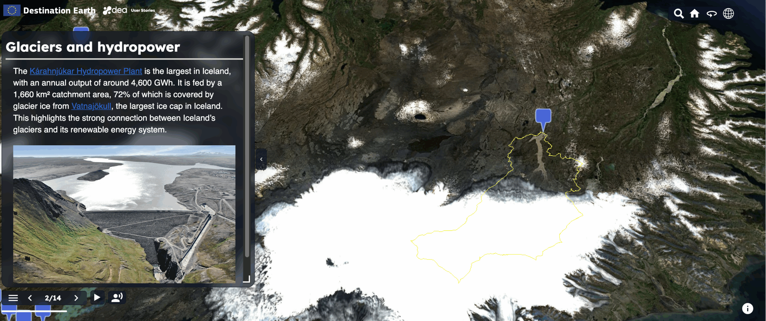
DEA’s “A glacier digital twin component to inform hydropower outlook” story
As you can see with the Iceland story, DEA’s web story editor allows you to work on slides individually and add your own text and imagery. You can explore a range of Earth observation datasets from the Copernicus services, the DestinE Climate Change Adaptation Digital Twin and others. You can also upload your own assets and use different 3D terrain settings to add realism to your story.
If you are unsure where to start, the DestinE Platform Learning Hub has a tutorial, and DEA’s documentation provides step-by-step guidance on all features.
VizLab
VizLab is an interactive service where users can access and explore complex datasets within a dynamic 3D/4D environment. What sets it apart is that it draws data from other DestinE services, such as EDEN, which itself includes Copernicus data, among other sources.
VizLab currently supports three dataset visualisation types: maps, streamlines and volumetric assets. Maps display 2D datasets mapped onto the globe, ideal for spotting large-scale spatial patterns. Streamlines animate directional data such as wind or ocean currents. Volumetric datasets add a vertical dimension, letting you explore 3D volumes like atmospheric layers or ocean depths. These formats can be combined in a single scene to compare multiple aspects of a phenomenon at once.
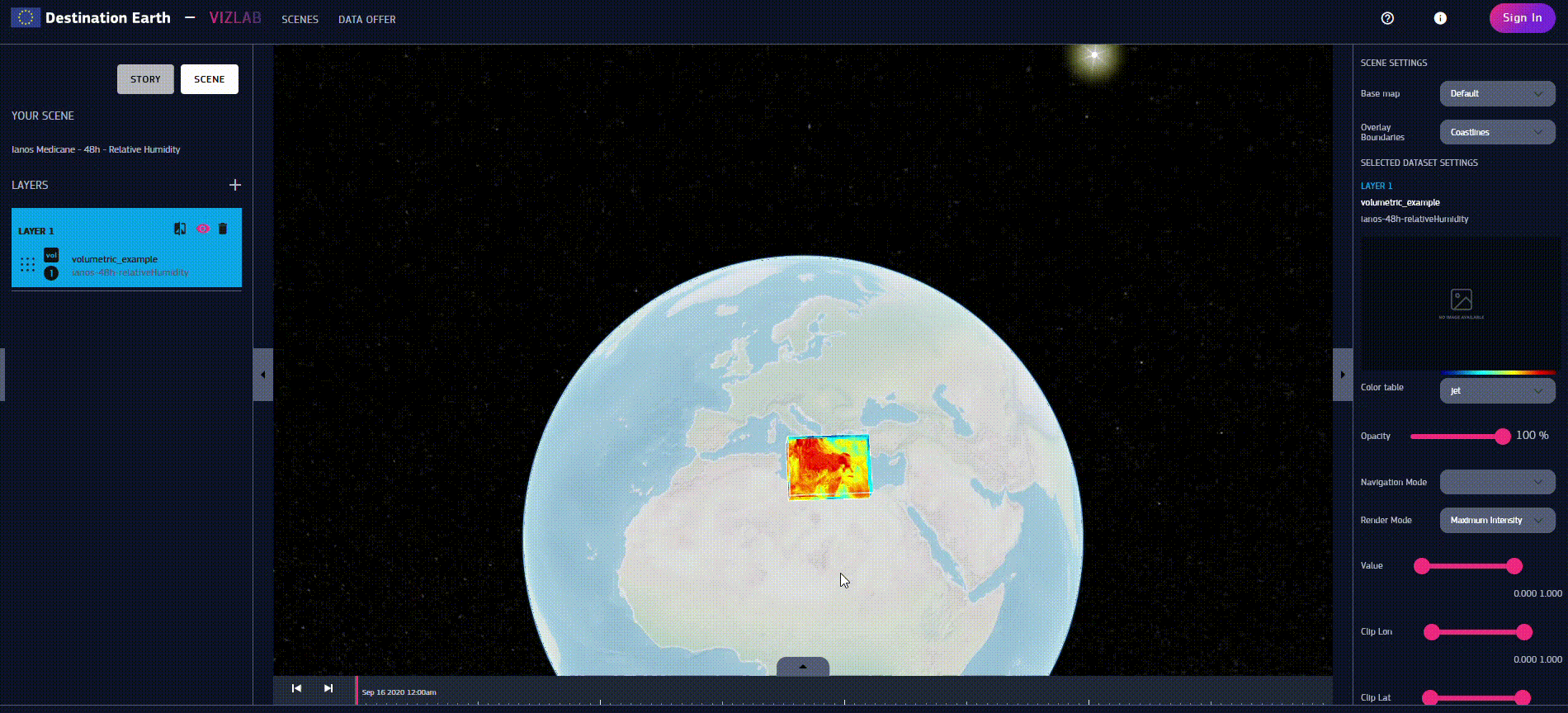
VizLab’s interface; a user exploring a Mediterranean tropical-like cyclone with a volumetric dataset
VizLab is built around two main work areas. The data offer page is where users can search, filter and preview datasets by name, region, time or type. The scenes page is where you can add data layers to a 3D globe, adjust visualisation settings, and animate changes over time with an interactive timeline. Registered users can save, publish and share their scenes, while public datasets and published scenes are accessible to all.
Vision
Vision is more complex to use, so it is best suited to experienced users. Combining satellite and in-situ measurements, it is a great tool for telling stories that draw on local data as well as space-based datasets. It is also different from the other services in that it can be used on VR/AR devices.
Within the DestinE PlatformSelf-standing DestinE system component, interfacing with the More, Vision has a range of visualisation options, including 2D, 3D, and 4D representations, to accommodate different analytical requirements and data types.
When you first access Vision, a 3D model of Earth appears, to which you can apply a set of layers. Vision supports several layer types, including volumetric datasets, 3D object layers for annotations and power network layers from energy datasets. You can source these layers from the backend, local storage or online resources and customise them as you add them.
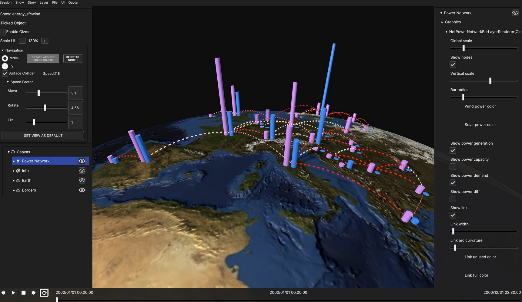
Vision’s interface showing a power network layer. This type of layer is a good way to display energy production levels in different locations.
Once your layers are ready, you can arrange them into a scene and then combine multiple scenes into a show – the complete sequence that makes up your story. For example, if you are illustrating how smoke from Canadian wildfires could affect air pollution in Europe, an early scene might include layers showing smoke emissions and wind patterns over Canada. A later scene could then focus on Portugal, with data layers illustrating how the smoke might impact the country.
If you are a newcomer in 3D storytelling, Vision can be complex to navigate, so we recommend exploring the documentation prepared by its developers to guide new users. If you have questions, feedback or suggestions for improvements to Vision or any other DestinE service, you can share them via DestinE’s Public Roadmap.
Over the next few weeks, more and more services will be added to the DestinE platform. Make sure you subscribe to the DestinE newsletter to stay up to date with the latest developments.